A website redesign centered on client communication and education.
CLIENT
Twin Town Floor Sanding
MY ROLE
UX/UI designer, brand designer
TIME
8 weeks
TOOLS
Figma, Airfocus, Photoshop, Illustrator
Background
Twin Town Floor Sanding is a hardwood flooring refinishing and installation service company started in 2012. It is a one-man operation, whose attention to detail and one-on-one focus on the customer sets it apart from a big operation that is working with multiple customers at once. Twin Town isn’t the cheapest place in town, but it is sought-after for custom work for a fair price.
The Challenge
Twin Town needs a responsive website design and branding refresh that will give a good impression of the business and entice more people to set up bids.
Prospective customers need a credible and effective platform learn about, vet, and connect with Twin Town; and current customers need ways to improve the communication process with the owner.
Project Goals
Explain: Prospective customers need responsive website that states the services available and introduces the company as a trustworthy & knowledgable local business.
Connect: The contact process needs to be seamless and easy to use, giving the customer choices in how to set up an estimate, and will save time for both the customer and the owner.
Refresh: Refreshed and built-out branding is required that engages prospective customers and makes the company memorable.
01. Research
Stakeholder Interview
Competitive Analysis
User Interviews
Stakeholder Interview
Interview goals
- Find out what the services are, some overall information about floor sanding and refinishing.
- Find out more about the service process journey from start to finish.
- Find out demographics of customer (to narrow future research participant groups).
- To find out if the owner has knowledge about customer pain points and/or needs and what those are.
- From a business end, what is the purpose of the website?
Findings: demographics
- ~60% women vs 40% men that find Twin Town and book, or are the main contact person
- Age group 30-60, homeowners, middle to upper middle income, most customers are in Minneapolis proper
- Most people find him through Yelp and word of mouth
- All customers are homeowners, most are house-dwellers (as opposed to condos or apartments)
Findings: Quantitative customer insights
Customers ask most about the durability of different finishes and the floors in general.
Another question is how inconvenient the floor finishing process is going to be for them, or what they have to do to prep (ie how long do they have to be out of the house, what furniture do they have to move, how loud, how smelly, etc).
Owner mostly wants the website to give a good impression of the company, and would like it to facilitate customer contact.
An opportunity for warmth and friendliness in the design
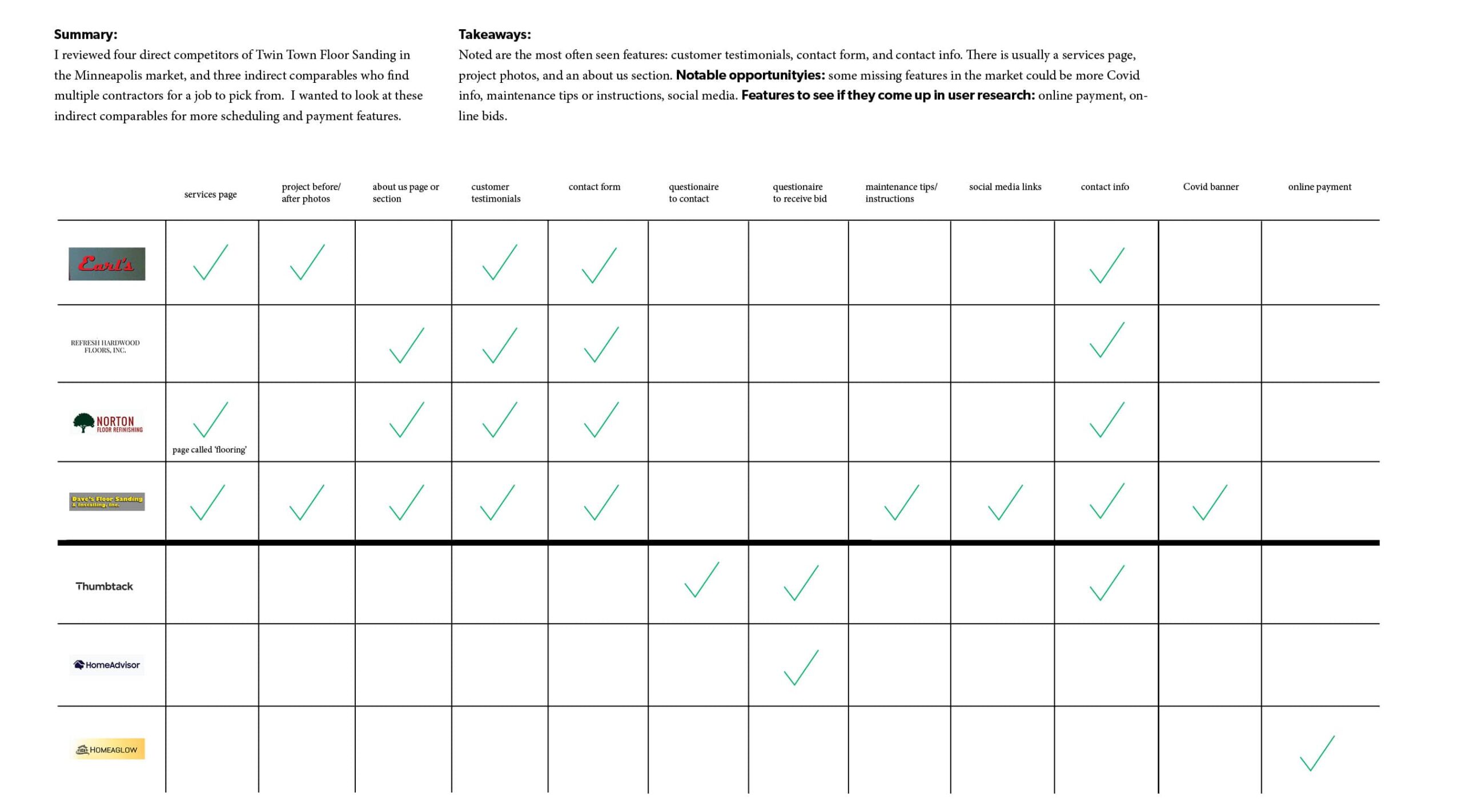
Taking a look at other hardwood flooring websites, I noticed many had a very stark construction or machinery aesthetic. Twin Town can distinguish itself with a more inviting design that combines the utility of a construction website with the warmth of a home.
Some notable opportunities could be maintenance tips or instructions, and social media. Most sites had a services page, a gallery, and customer testimonials.
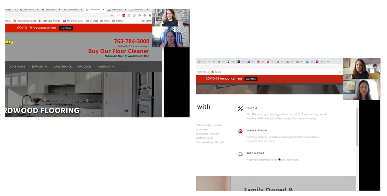
Interviews and observation to determine the user's mindset and decision-making
I’ve gathered 4 interviewees ranging in age from 38-42, three females and one male. All interviewees are homeowners, live in Minneapolis or St. Paul, and have hired service professionals for their home.
GOals
Find out the participants' decision-making process and the thoughts and feelings surrounding that process
Their thoughts and feelings during the home service process. What are the needs and pain points? Communication processes?
Observing participants interacting with a competitor's website:
What information do they look for on the website? Overall impression?
02. Define
Affinity Map
Persona
Empathy Map
Content Strategy
Synthesizing data to understand the user
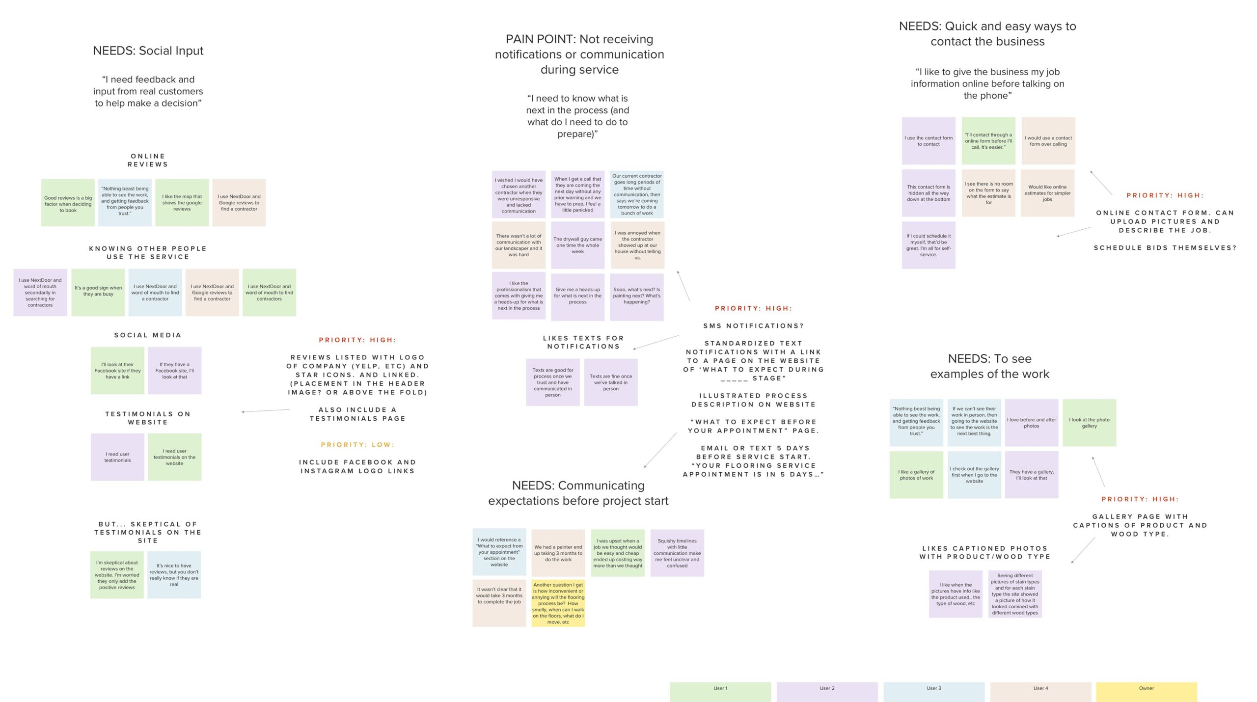
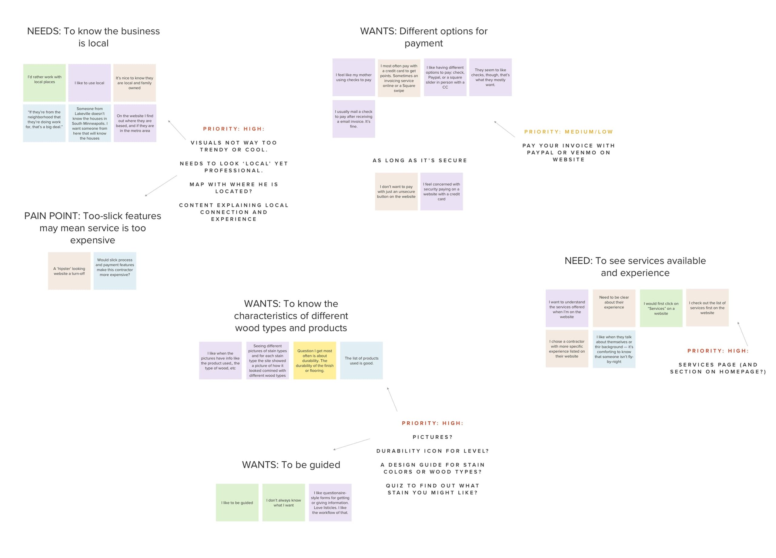
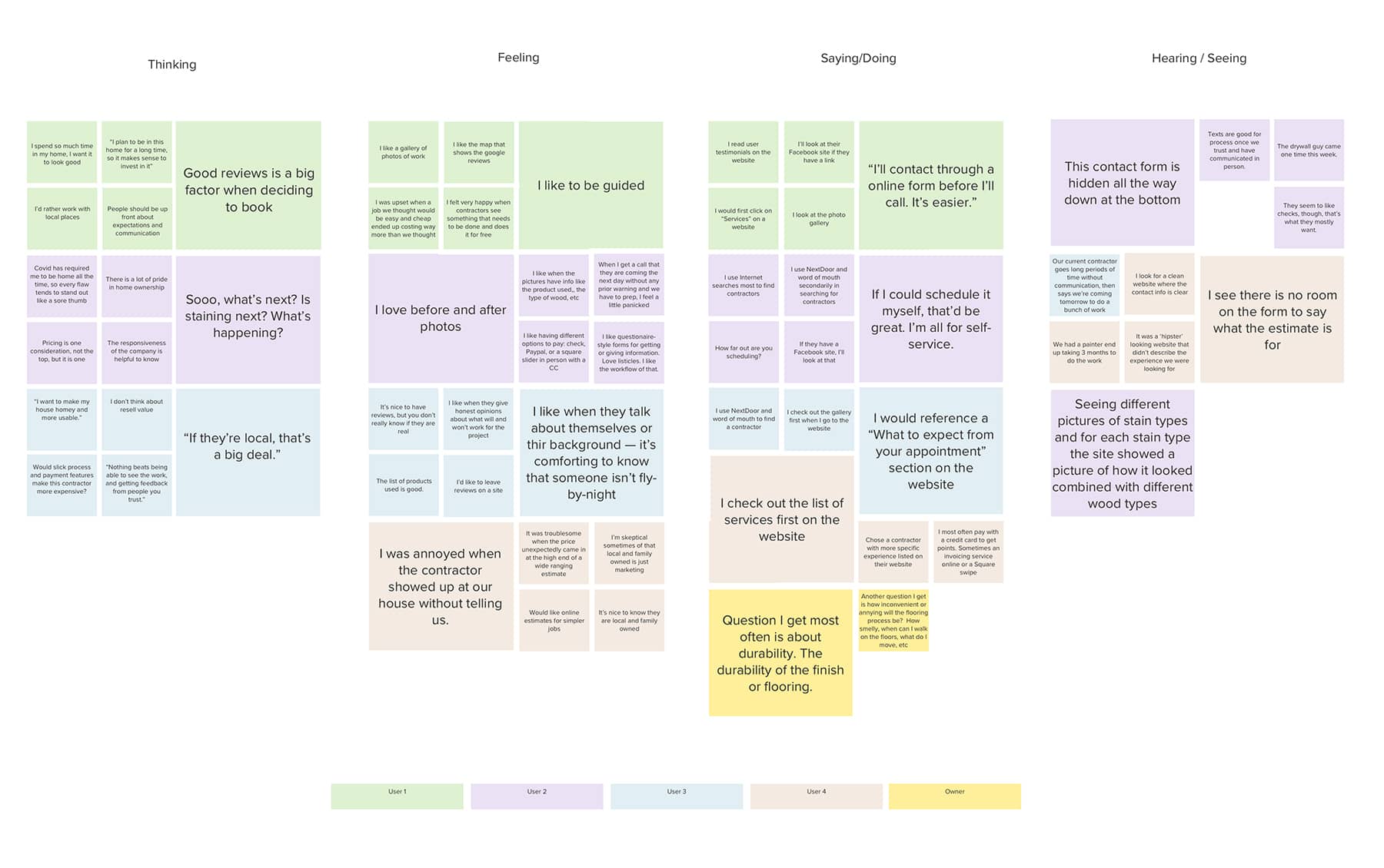
After the user interviews, I organized the raw data using an affinity diagram. I grouped ideas based on similarity and noted priority based on importance to each tester and frequency of mentions among testers. I included stakeholder data in yellow. This led to initial design ideas that I noted as well.
Trust
Most testers said trustworthiness along with a skills and services fit are major factors in decision-making. The website needs to introduce the owner as a knowlegable, trustworthy person, and describe skills and services clearly.
Social Input and Visual Proof
All users expressed the need for input from real customers to be able to trust and contact a service professional.
Three out of four testers need to see visual examples of the company’s work.
Lack of Communication
All the testers have had problems with lacking service professional communication; especially in term of the process, timelines, responsiveness, and expectations for the customer.
Seeks hyper-local business
Supporting local small business is important to the customer; they need someone who lives in and understands the needs of the area.
Guidance
Half of participants mentioned that they liked guidance surrounding services they don’t know much about. Expert opinion and knowledge builds trust and value.
Contact & Communication Options
The contact portion of the website was a priority, and most testers liked a non-phonecall format, but like options. Half mentioned interest in self-service scheduling.
The Home Manager
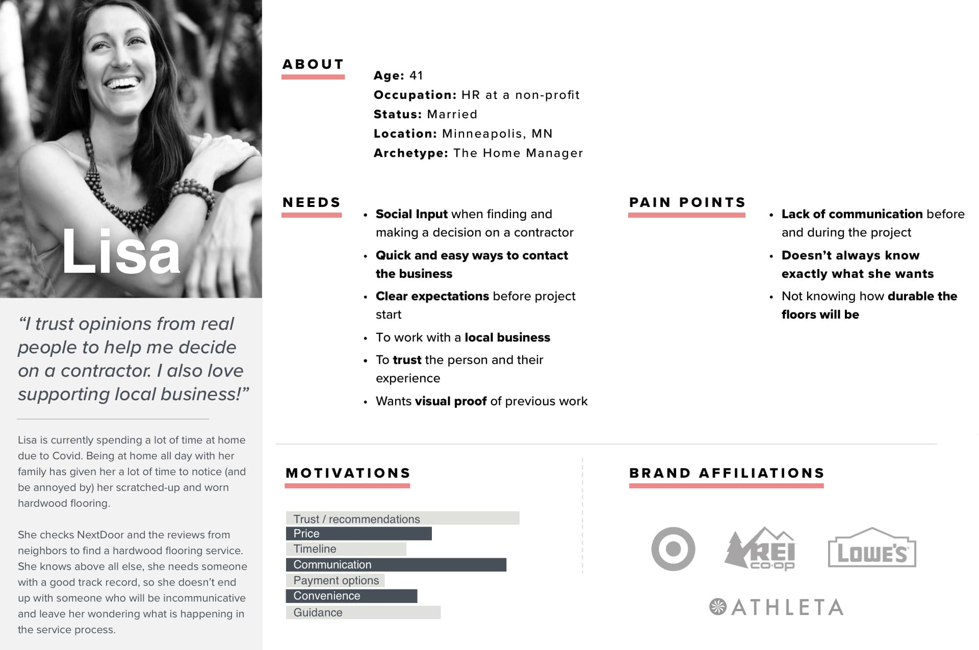
From the user interviews, I identified a persona based on the customer demographics and unique motivations for deciding on a flooring company.
Stressing the importance of trust, social and visual validation, and an emphasis on communication and guidance. I also created an affinity diagram to steep myself in her thoughts and feelings.
Determining Priorities
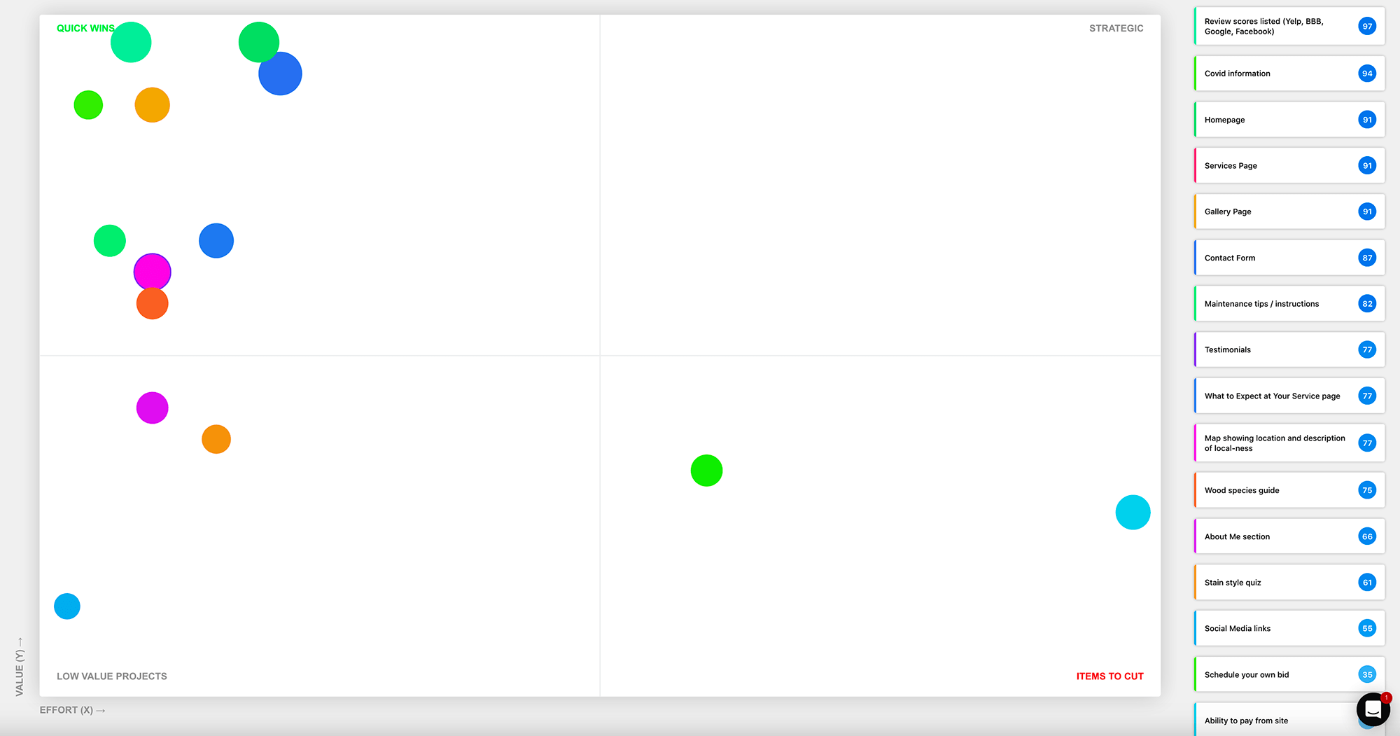
The site Airfocus was used to create a Gantt chart to view priorities. From this analysis, I’m going to cut the features: ‘paying through the website’ due to low user priority. I’ll leave ‘scheduling your own bid’ feature for future implementation the due to time and logistics, and lack of stakeholder investment.
03. Ideate
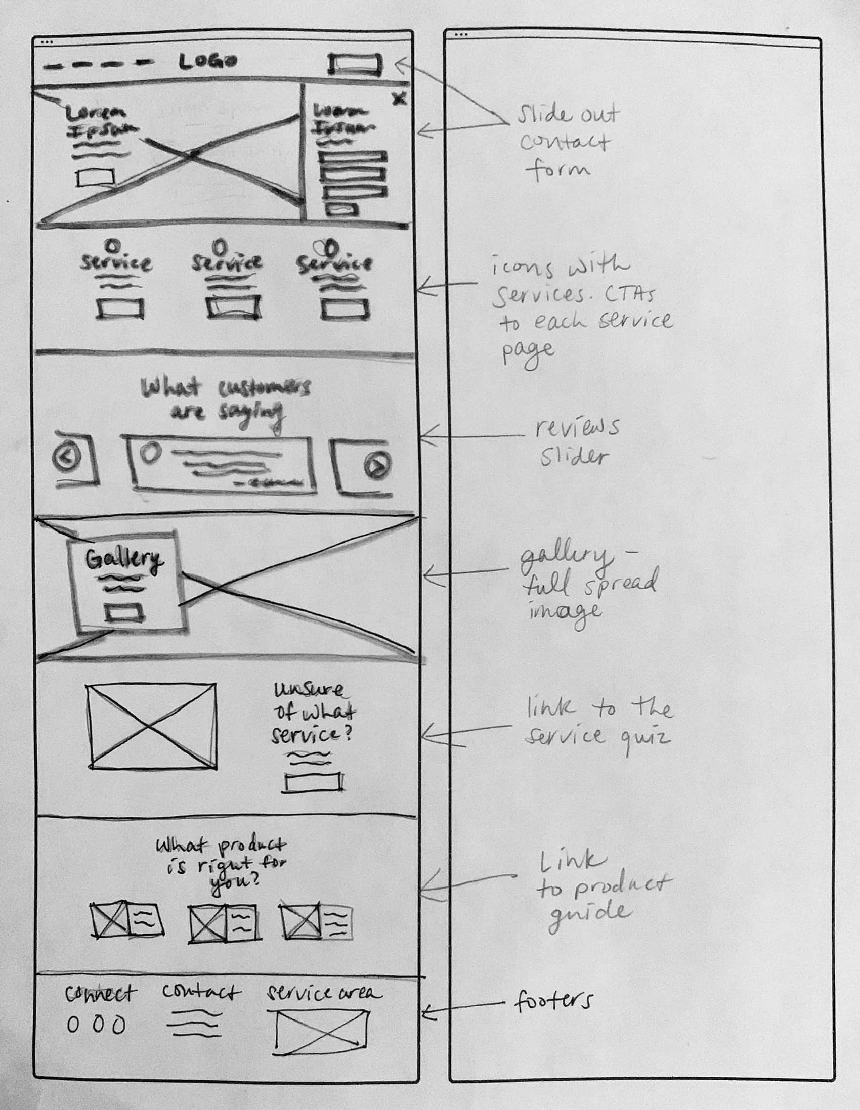
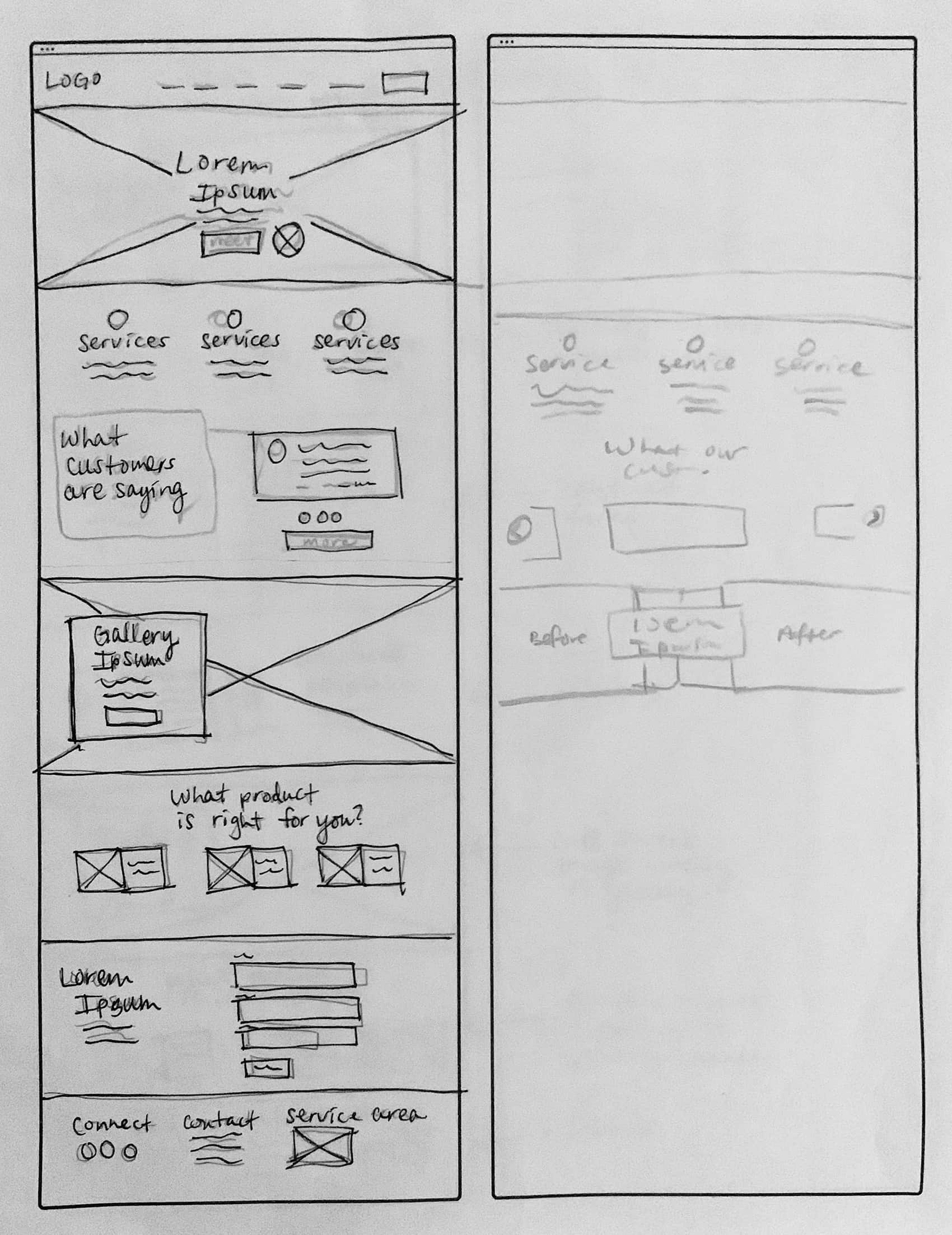
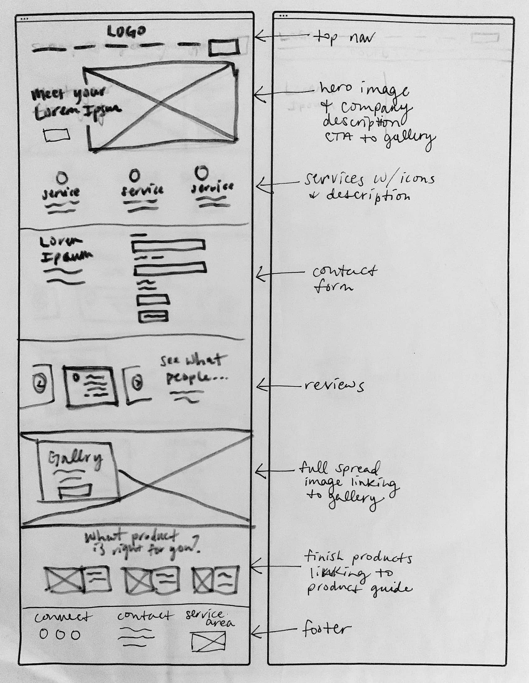
Sketching
Wireframes
Explain
Prospective customers need information regarding services available and introduces the company as a trustworthy & knowledgable local business.
Prove
The site needs to prove competency and credibility through photo proof and trustworthy social input.
Guide
To inform and notify current customers on what is next in the process and how they need to prepare.
For potential customers who don’t know where to start or don’t know exactly what their floors need.
Connect
The contact process needs to be seamless and easy to use, giving the customer choices in how to set up an estimate, and will save time for both the customer and the owner. Contact shows up in multiple places, and is a constant throughout the flow.


04. Visual Design & Branding
Branding
Logo
UI Kit
High-fidelty wireframes
Confident, competent and warm
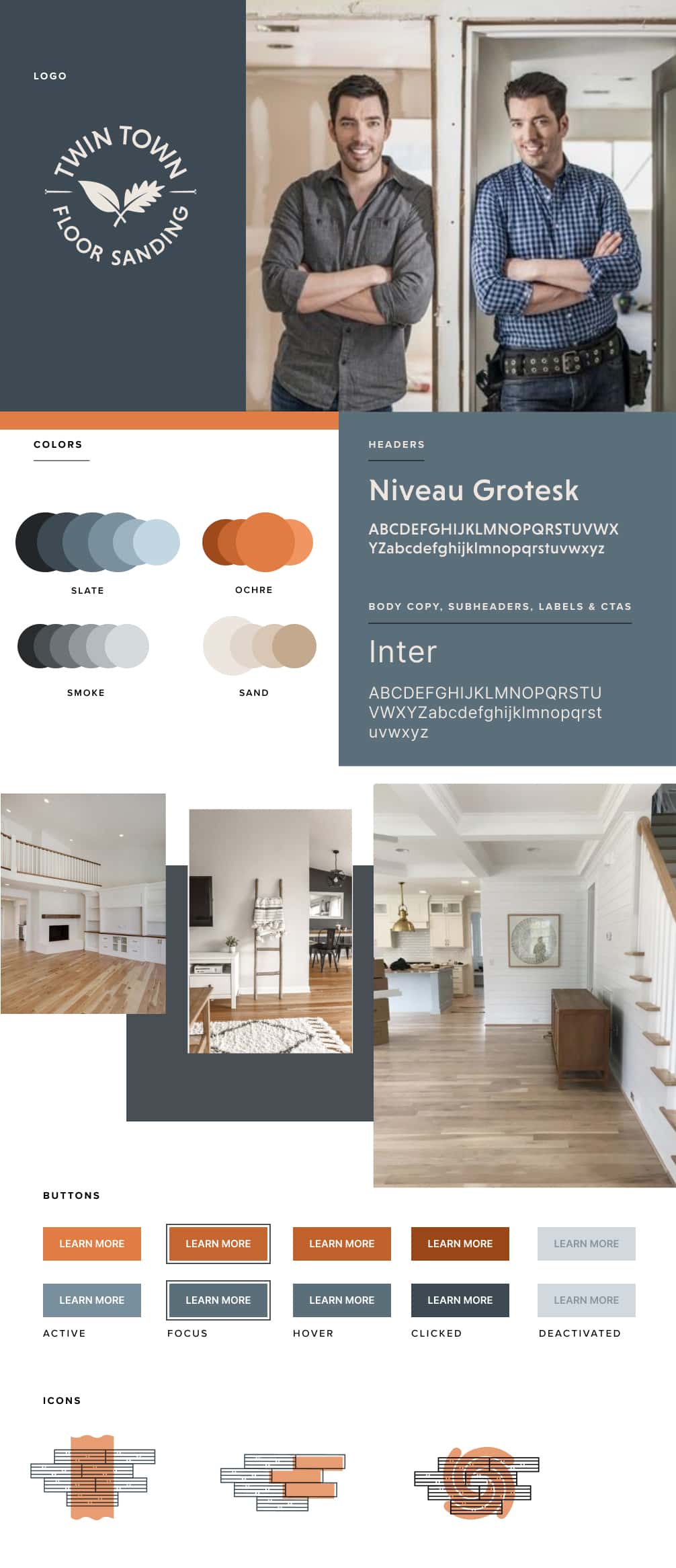
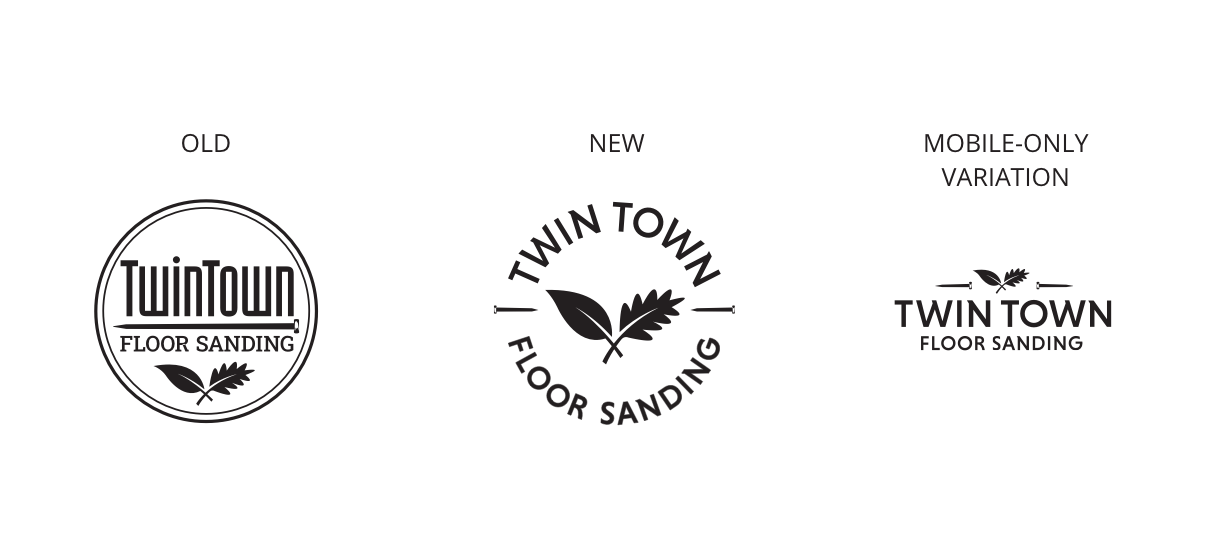
I went through iterations of the logo that kept elements of the old logo for continuity, but refreshed and updated the look.
The visual design took into account the user comments of a dislike of websites looking too cool or hipster-y. I wanted to find a middle ground between the gravitas of a traditional ‘construction’ look and the warmth and friendliness of a modern home decor vibe
Brand Keywords:
Credibility • Craftsmanship • Communication • Local .
Visual plan and patterns
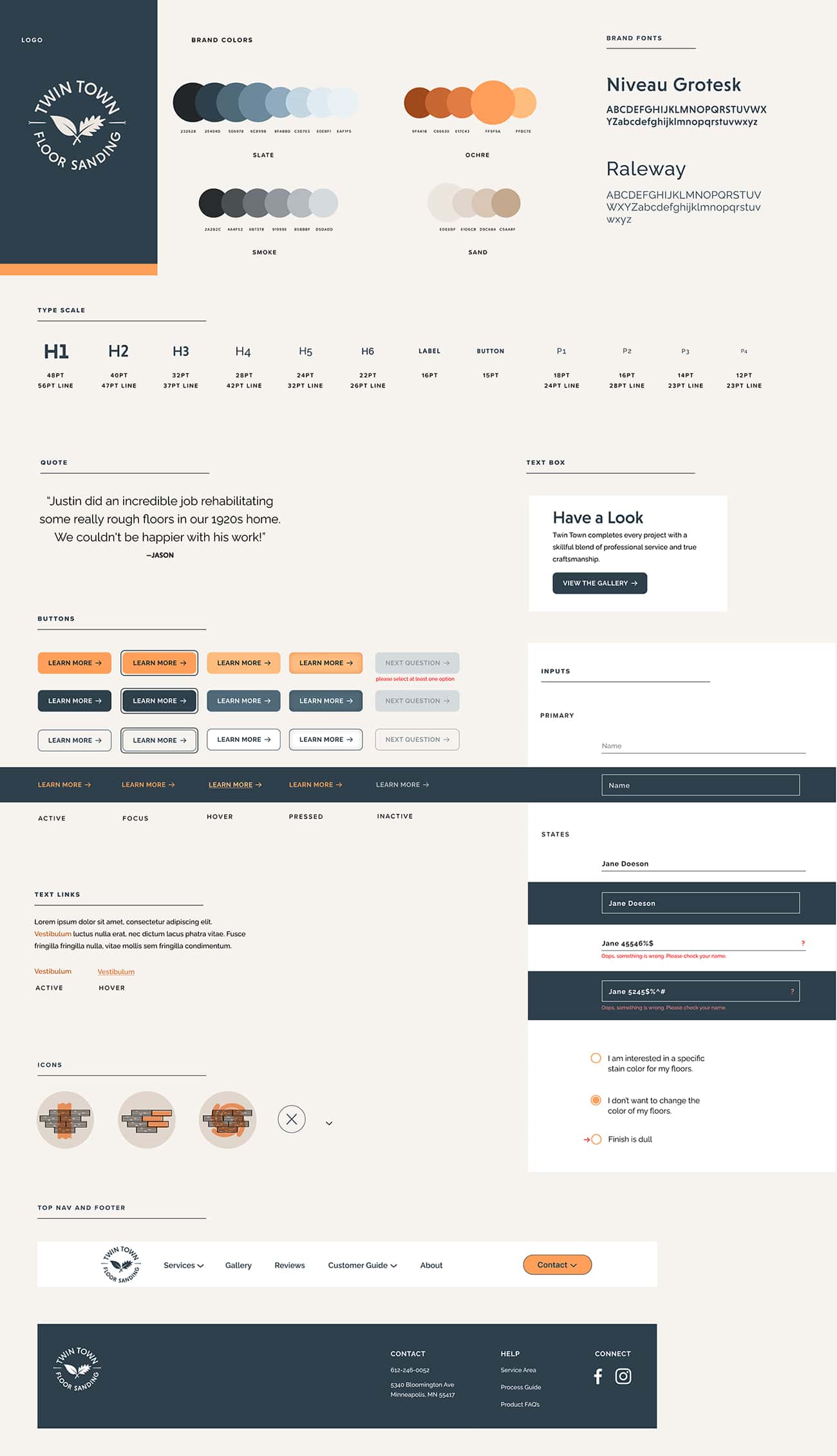
After developing a high-level view of the branding and visuals, I developed component and pattern systems. This style guide was applied to the wireframes and could be given to the development team so that the design can be implemented collaboratively and seamlessly.
High fidelity responsive wireframes
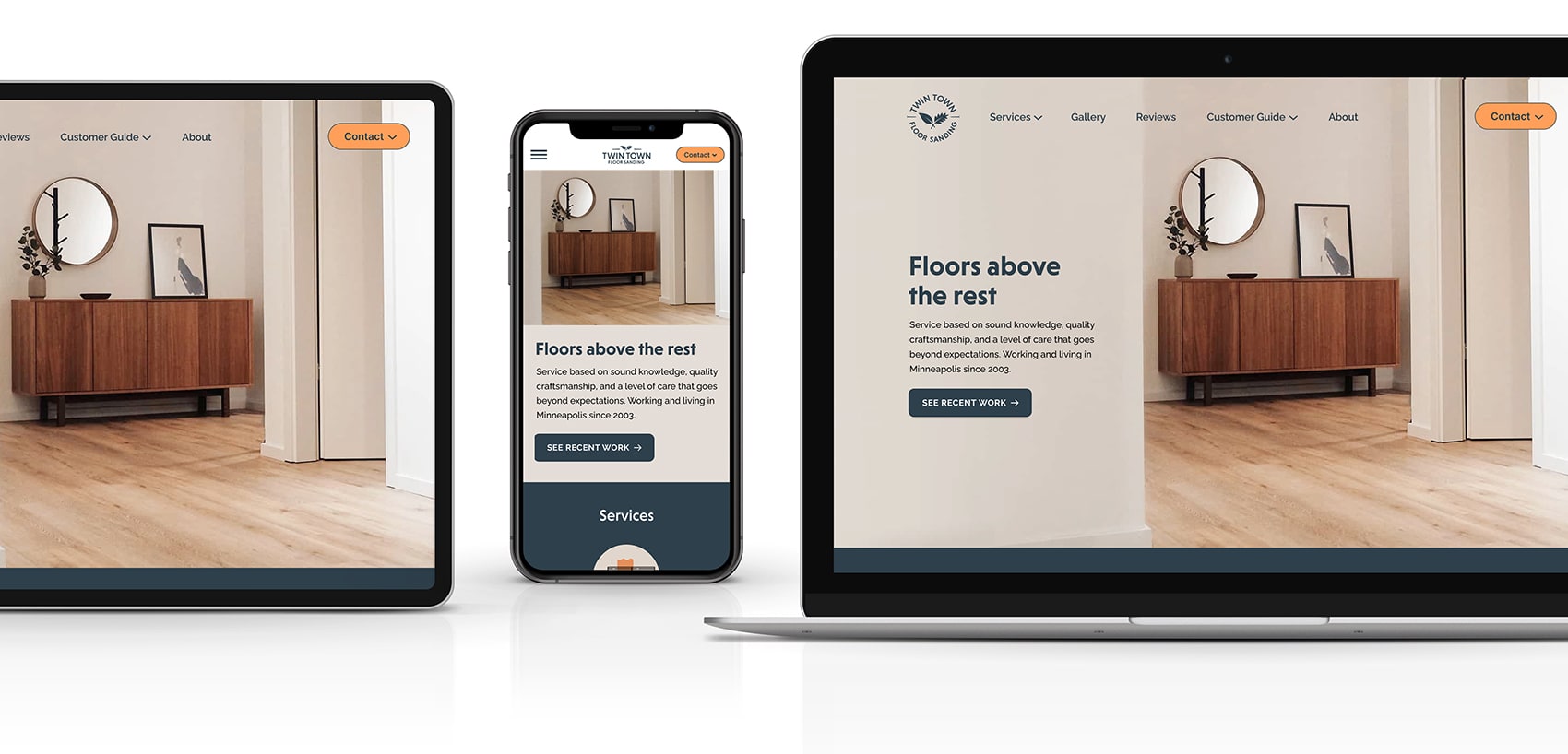
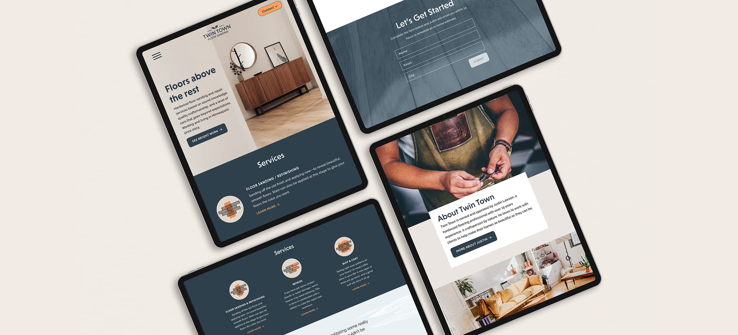
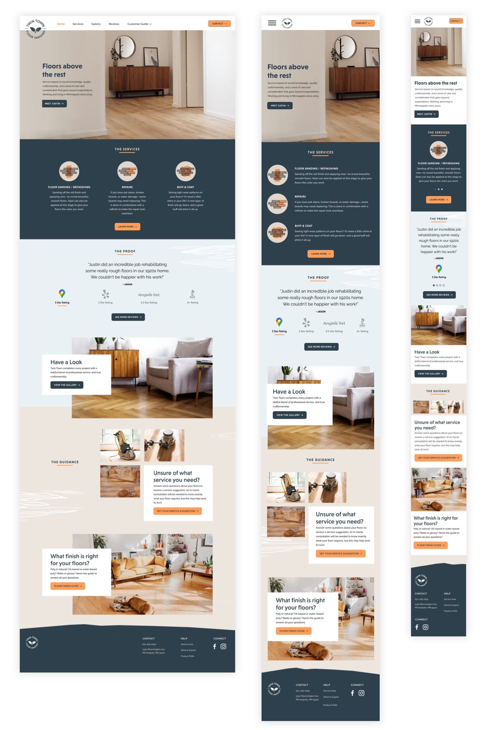
After creating the plan for the visuals, I implemented them into the mid-fidelity responsive wireframes. Consistency was key here, as well as keeping the visuals clear and within a clean hierarchy.
Stackable modular elements
Each product card and product feature on the homepage acts as an independent element that can be stacked in mobile without significant reduction of font or image sizes.
05. Testing & Iteration
Prototype
Testing
Changes & Final
Prototype & testing
I recruited four testers who all fit the persona: women living in and around Minneapolis who were in charge of the research and contacting of home services for their family. I tested them on two tasks: find and complete the contact form, and find and complete the Service Suggestion Quiz.
The homepage as a one-stop
information hub
Most users expect to find most information about a new company on the homepage. The pertinent information needs to be accessible without clicking off.
The guidance aspect surprised & delighted
Users were pleasantly surprised to find there was the ability to learn and be guided on their own without having to contact someone right away.
Options to contact
The testers generally liked the look, feel, and the instant completion aspect of the contact form; but wanted the option to call as well.
An in-depth introduction of the owner
Half of participants wanted a more in-depth introduction of the owner on a more personal level.
BEFORE

AFTER

Distinguishing sections
I created distinguished groupings and sections to make each piece of information more digestable and understandable.
Giving each service a CTA
Testers mentioned they wanted to find out more information about a particular service after reading the intro for each in the Services section. A CTA was added to each service introduction to give users specified information.
An invitation to connect to finish the homepage flow
I added another contact form at the end of the bottom of the homepage, so that after gaining information, the user is sure to have that connection point available.
Nav bar elements in viewing proximity
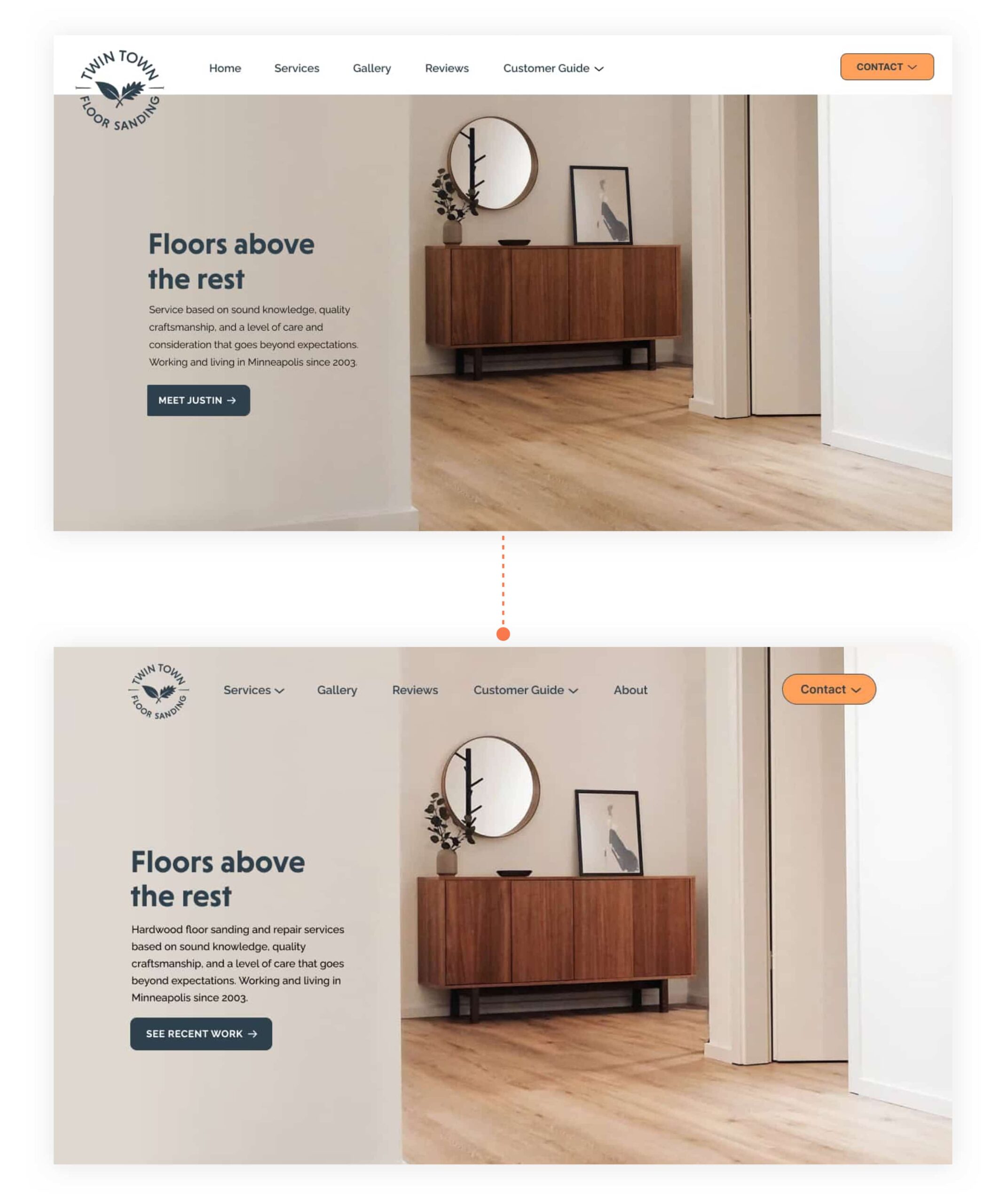
I moved the top nav bar elements closer together instead of full frame. This made the contact button closer and more connected with the top nav, and a smoother viewing flow from left to right, since some testers missed the contact button.
Making sure the logo is is adaptable
The overlapping logo created problems for the sticky nav bar when scrolling. Fitting it in the nav bar also made it more apparent the the logo is clickable, and would take the user back to the homepage, negating the need for a Home menu category.
Developing trust with the company and owner
An About page was added to introduce the owner on a more personal level, and a short intro was added to the hero copy.
Adding friendliness and clickablility
The corners of the contact button were rounded to make it distinct among the rest of the buttons on the page. I also changed the letters to title case, to make it friendlier and more clickable.
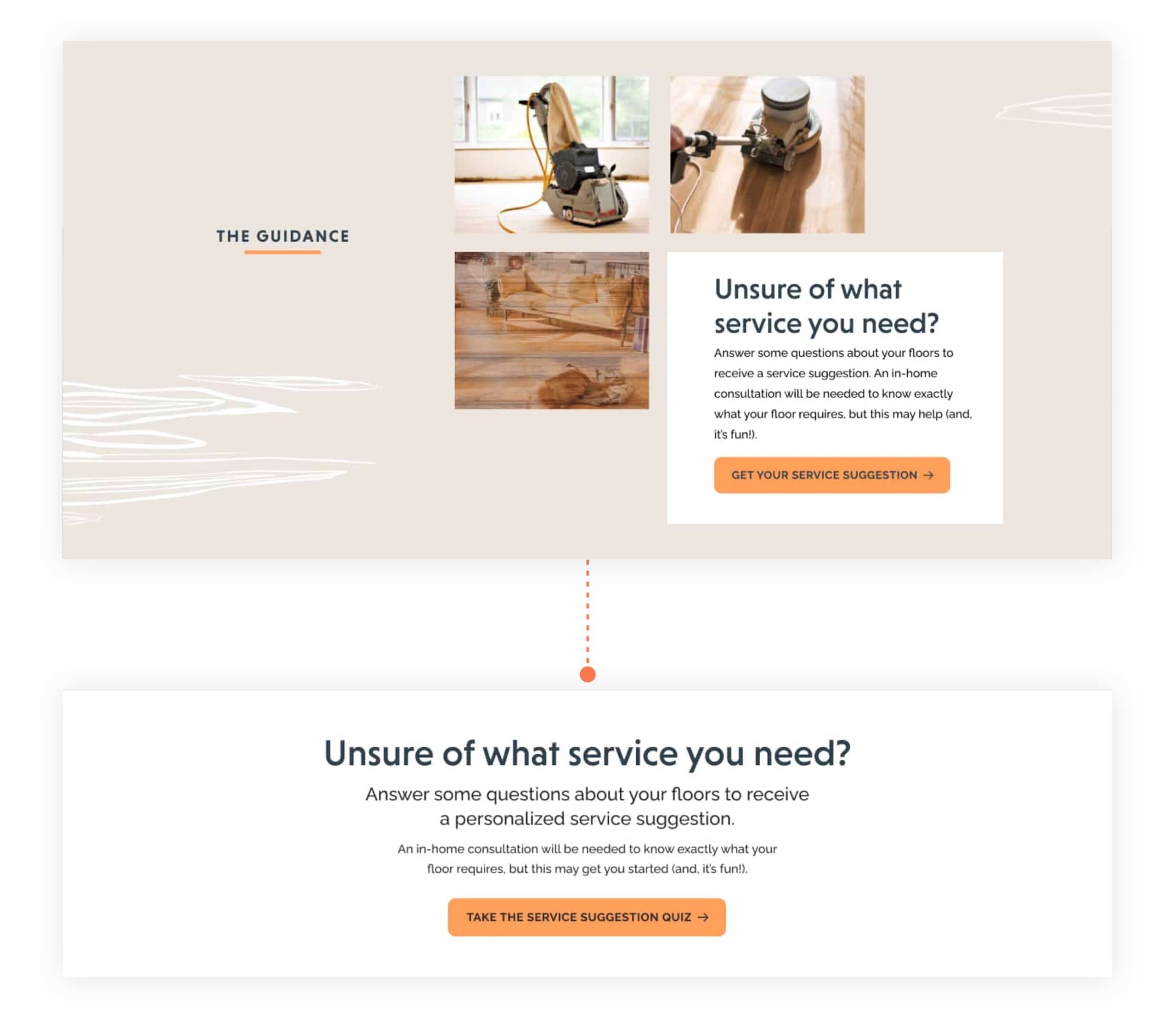
The Quiz’s explanatory content was simplified visually on the homepage.
I highlighted the question “Unsure of what service you need?” due to the testers’ positive responses. That also increased simplicity and readability.
