Clarifying booking checkout
CLIENT
soona
MY ROLE
product designer
TIME
3 weeks design
TOOLS
Figma, Photoshop, LogRocket, Slack, Jira
The Challenge
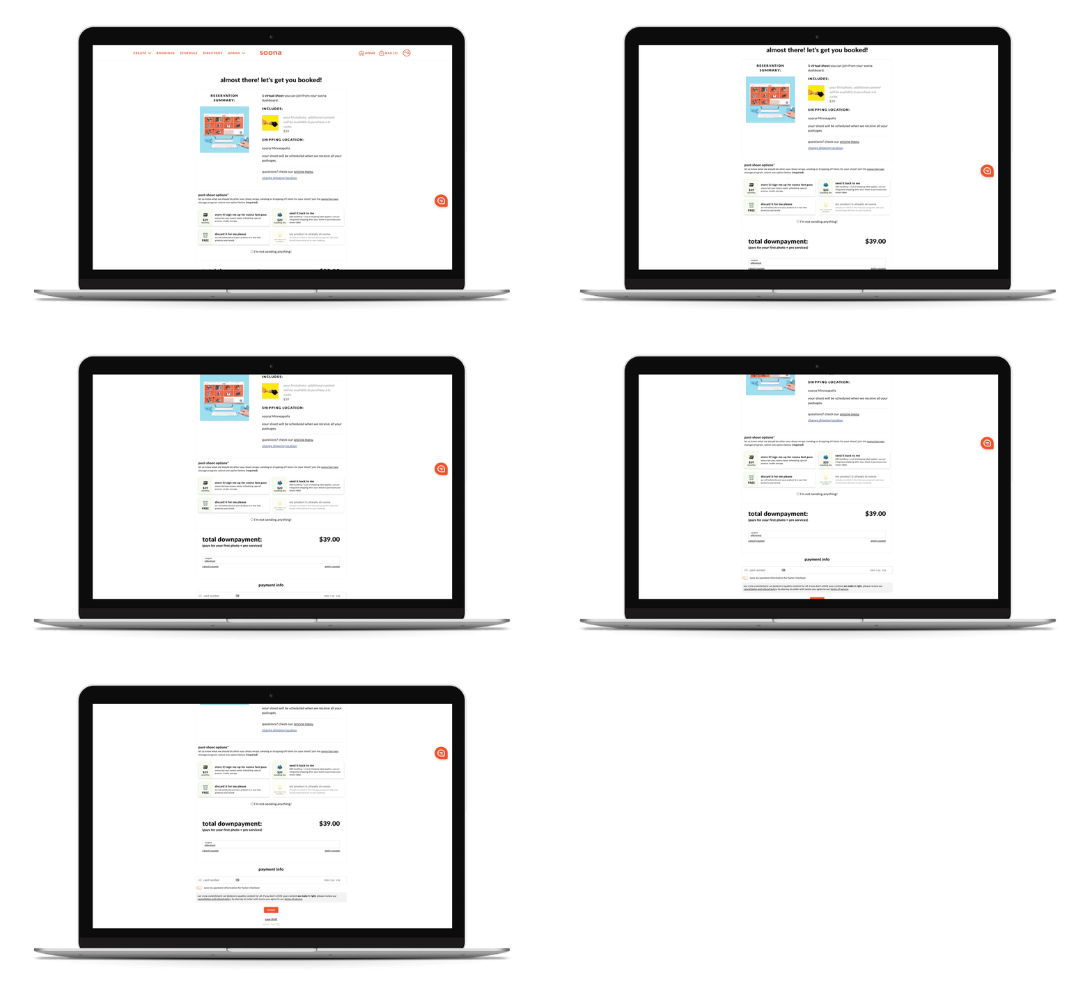
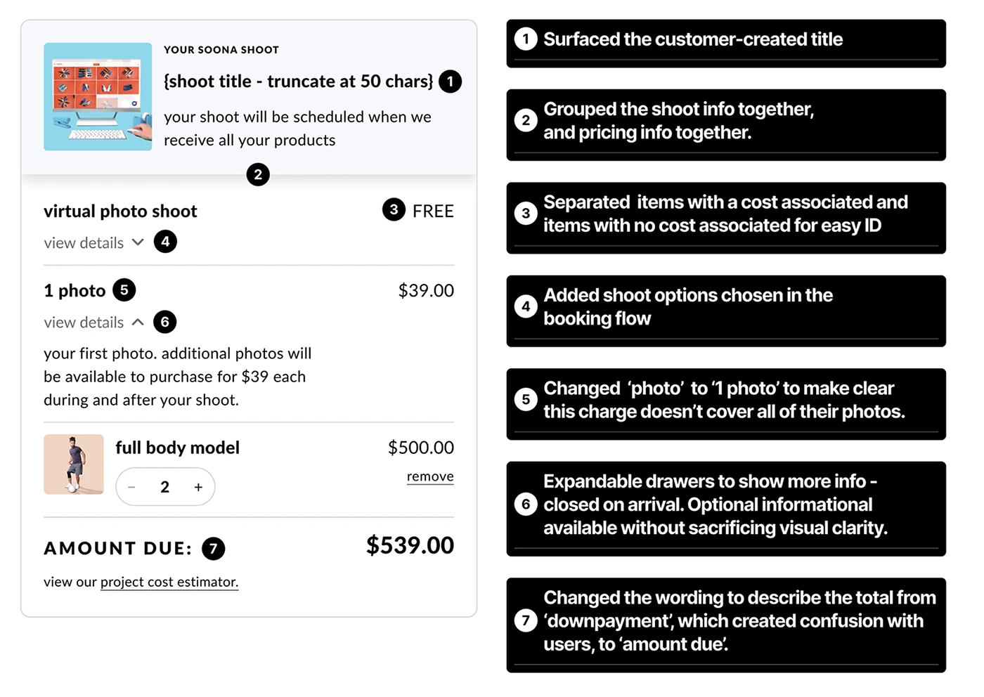
Over the years, the checkout page at the end of the booking flow at soona had fallen victim to numerous quick feature and design additions. Customers were confused about what they were paying for and what choices they had made. The information was disjointed and the hierarchy was off.
Opportunities + Goals
Increase clarity and visibility for pricing and choices made in the booking flow.
Make a design that is ready for scalability and adding features.
Business goal: to increase conversion from this page.
🤑 Impact (spoiler alert):
5% increase
in conversion rate
from checkout page (viewed) to checkout completed.
Discovery & Research
I had an idea of the general UX opportunities for the page from an analysis of the page, but to make sure I was fixing specific user points of confusion, I scoured feedback channels and interviewed CS.
💡 key takeaways:
Users aren't able to recover from errors
Error states were shown below the main CTA button far down the page—but not where the error actually occurred. It was hard to know what was missed.
Wanting an estimate of all costs
Clients want an estimated final price of the entirety of the shoot – they want the numbers crunched for them.
Requiring recall from the users
Customers can schedule their own in-studio shoots. However, we do not reiterate that shoot day and time on the check out page. We also do not surface all of the user’s selections made in the flow.
$20 handling confusion
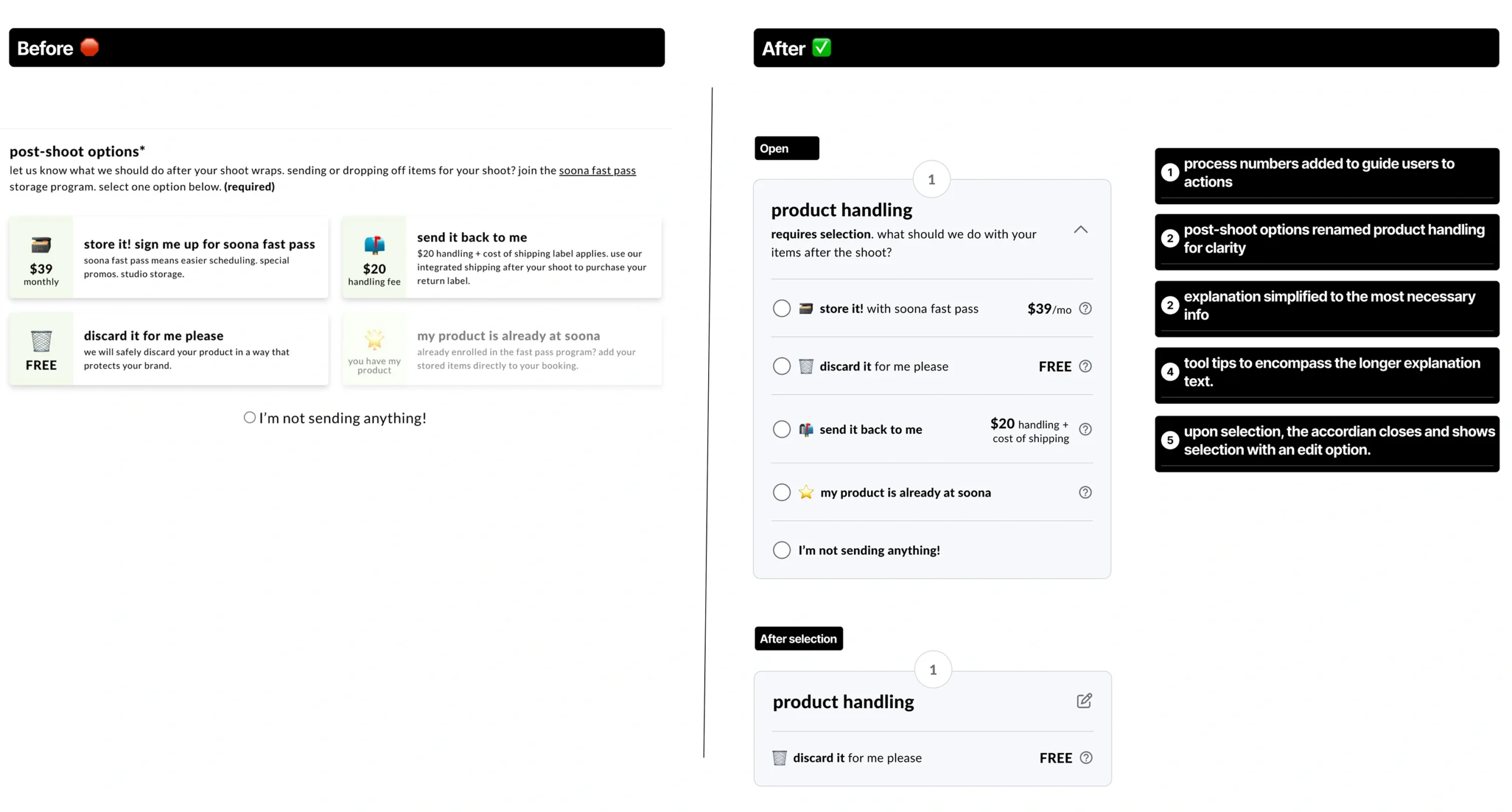
Within the post-shoot handling options: when the customer chose 'send it back to me', they were surprised by the $20 handling fee and that they had to pay additional shipping on top of that.
"I'm all done"
Some customers thought that at the time of booking check out, they had paid for everything they selected. However, they only pay for one photo, the rest they can buy a la carte after the shoot. This needed to be more clear.
Downpayment confusion
Some customers don’t know what soona called the 'downpayment' is nonrefundable.
Users need a checkout page that helps them understand what they are paying for now and later, and establishes trust in soona.
Changes and Updates
Creating efficiency, clarity and trust
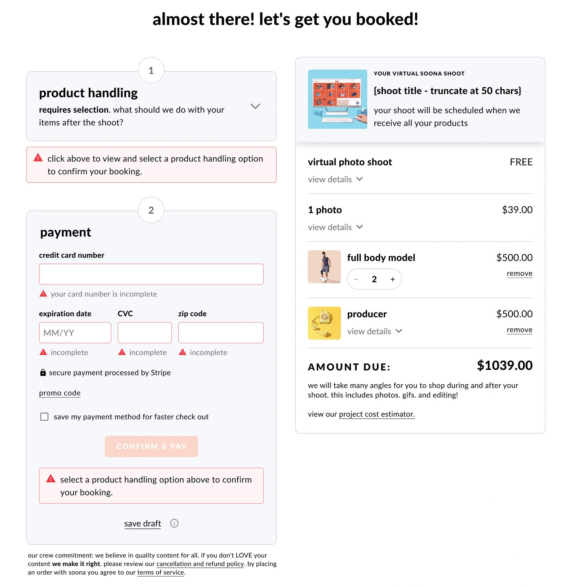
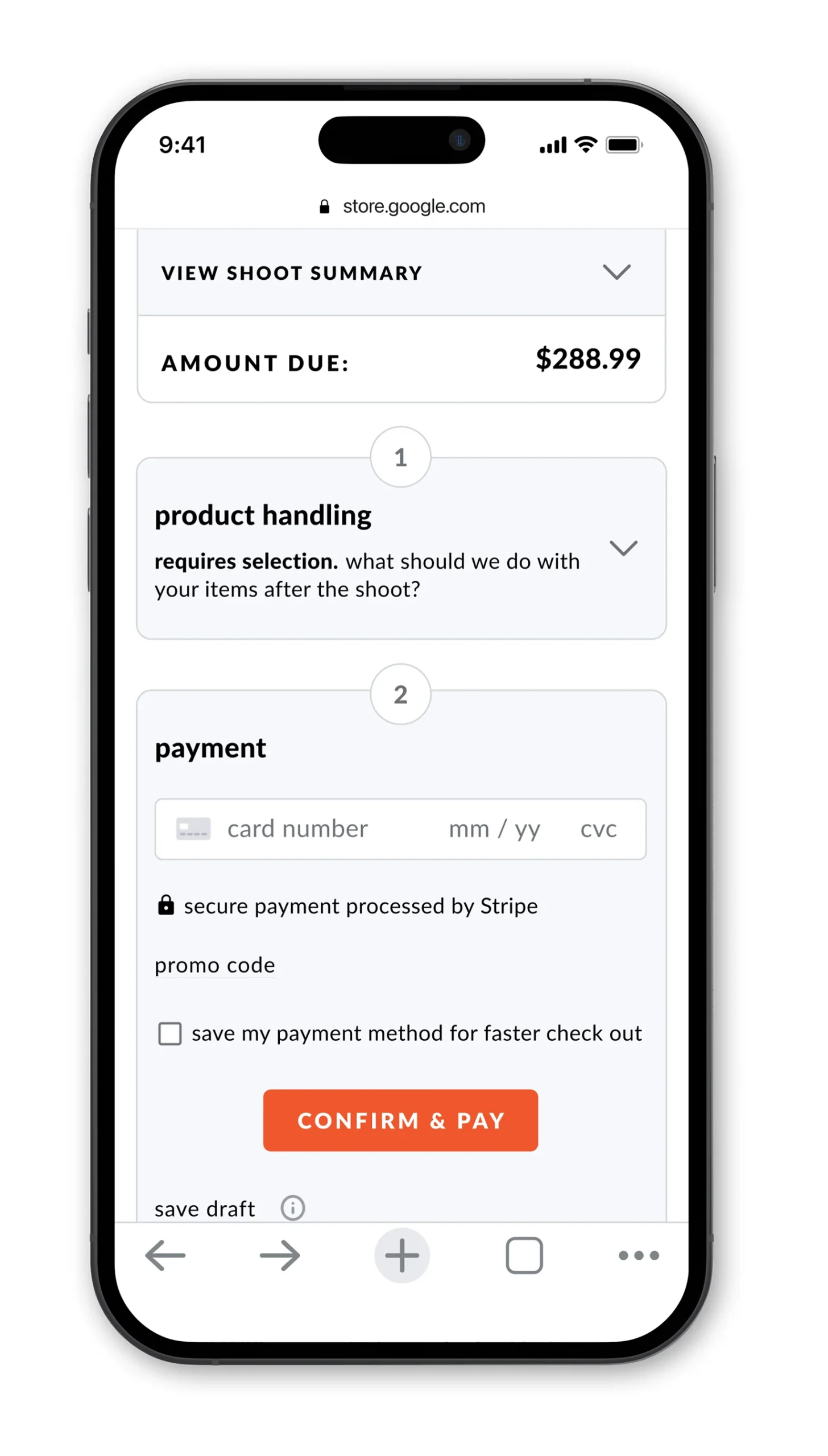
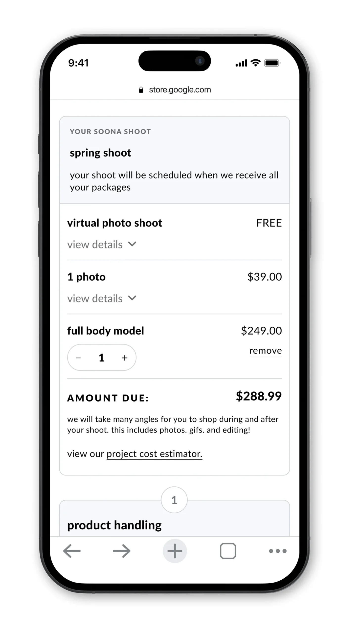
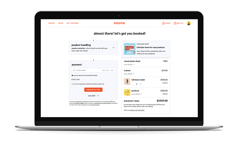
The new design gave users a better reflection of what they were paying for and in a more organized way. I surfacee more selections from the booking flow, grouped relevant information, and reworded confusing language. The totalisty of these changes enhanced trust in soona's process and also proved crucial on a high-conversion page where trust is paramount.
Reducing decision fatigue and cognitive overload with a simplified design
- The product handling section was difficult for users, because they weren't ready to make those decisions until closer to the shoot. However, this section was a business requirement and needed to remain.
- Simplified and improved the hierarchy of information.
- Made it more clear that choosing 'send it back to me' entailed a $20 handling fee plus the cost of shipping.
Error states added
A big problem for users was the lack of comprehensive error states on this page. Especially, the lack of an error state for a failed transaction, and insufficient error states for not selected a product handling choice. This error state not only creates an expected user experience, it helps soona not break trust with the customer.
